formatting the paperback edition
It’s all very well to write a book perfectly, ie, say something worth reading, fix all the typos, etc.
Formatting the text and illustrations neatly on a page? That’s another task.
With about 12 words on the average line, if there are large words at either end with justified text you can have excessive spaces between the words. When designing a book it’s worth doing a line by line adjustment to the text as required, changing the word order, or substituting words to remove goofy gaps.
With that all done I had to do a quick scan to avoid the subheadings appearing near the bottom of the page — I felt you really needed three lines of text beneath any heading. There were quite a few times when I had to add some additional lines of text to bump the heading to the top of the next page.
Then it was the case of getting the main chapter headings on the appropriate left/right side of the book. I wanted maps on the left-hand side, with the writing starting halfway down the next page.
The final check. Actually I did a couple of read throughs of the PDF file I was going to submit, to ensure all the formatting was sorted.
Then when I finally uploaded the PDF file to the on demand publisher, CreateSpace, there was a proof to download, and do yet another read through to ensure everything was 100%.
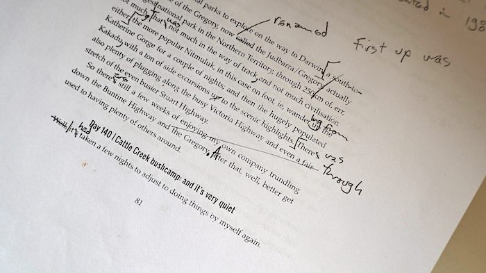
By this time I had travelled from my original handwriting, dictating the text into my blog, agglomerated the blog into an e-book file, changing my blog style present tense to the appropriate past tense, printing it out and editing and embellishing — at least six times. Then converting to a paperback with all the additional readings and tinkerings.
Overall I think there has been 14 major revisions with hundreds of changes each time around, expanding 45,000 words of the original blog to 105,000.
Seeing the book actually in print it’s at the point where it’s as good as I can get, and I’ll never have to fiddle around with it again.
Yay for that, you can get way too close to these things.
