
four Design Principles, plus another one for free
With my first hack at a website back in January 2009, a blog made with iWeb that eventually evolved into my cycletrailsaustralia.com, I had four Design Principles that were at variance with what was then current practice.
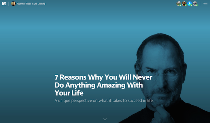
1. Bung a humongous, striking image at the top of the page, those images are worth 1000 words, apparently. It was clear that with broadband rather than dial up that tiny images could become more prominent.
2. Remove every piece of clutter, any distractions, from each page. Websites at the time had multiple columns, multiple threads all jostling with each other.
3. Continue the austerity to the type, ie, only have two sans serif fonts, one for headlines and the menu and another for everything else. Actually, for that first Mac website there was only one font, regular and bold, Helvetica Neue, in #333.
4. The text was one long, scrolling column. This was quite different from most of what else was around, maybe I was too influenced by the Apple site which also had vast acres of white space, that too has survived the last five years with pretty well the same concept.
By August 2010 when I created my second Textpattern site, I found I had acquired another design principle:
5. You don’t need to reinvent the wheel with every new website. OK, I moved the menu, changed the color scheme and fonts maybe, but there was the same underlying structure. Now all my personal websites, and I’ve come up with five where I am the client and developer, look rather much the same.
I had the feeling that it was more useful to have a similarity of layout, a family of websites, recognisable, than to create difference, a giraffe or hippopotamus for each new site. Then again I’m much more the content creator, the substance of the site is more important than the framework it’s displayed on.
It’s funny that now many of my favourite websites exhibit that similar layout, maybe it’s due to having to fit stuff in smaller screens, ie, big picture up top, one column beneath, austerity, no fluff.
thegreatdiscontent.com. Long interviews with various creative types about their career path, inspirations, etc.
medium.com. Just plug any of your writing up and have it critiqued, sometimes severely.
These sites focus on their content, the website framework has just faded into the background.